

The app is aimed at everyday issues and needs that affect many people - managing shared expenses. Although Splitwise already offers many useful features, we realised from our own user experience that the usability and functionality could still be optimised. Our goal was to improve these areas and, where necessary, replace old, outdated features with fun ones.
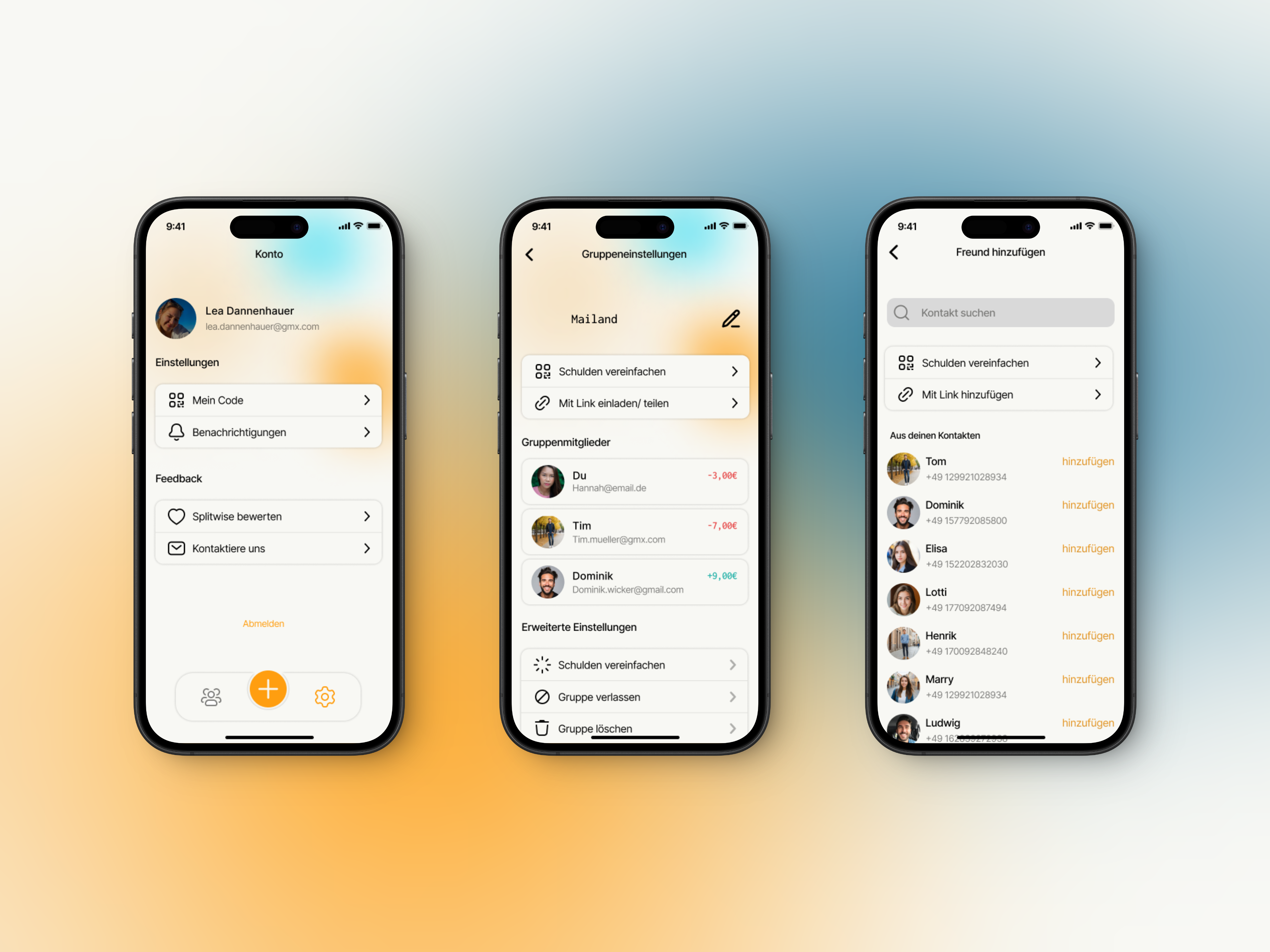
Screenflow
Competition analysis
Classification of characteristics
Kano Analysis
In the first phase, I created a screen flow of the old app, analysed its existing features and carried out a competitive analysis. It was particularly important to evaluate features and categorise them in a Kano model in order to decide which functions should be developed further, removed or added. This analysis showed me that many existing features were unnecessarily complex, while others, such as the integration of in-app payments, offered great potential.
Screenflow
Competition analysis
Classification of characteristics
Kano Analysis
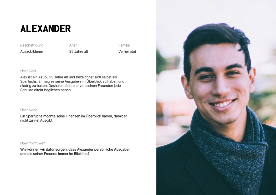
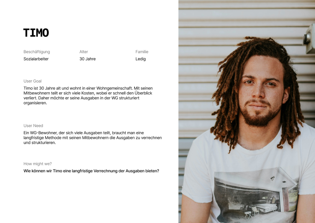
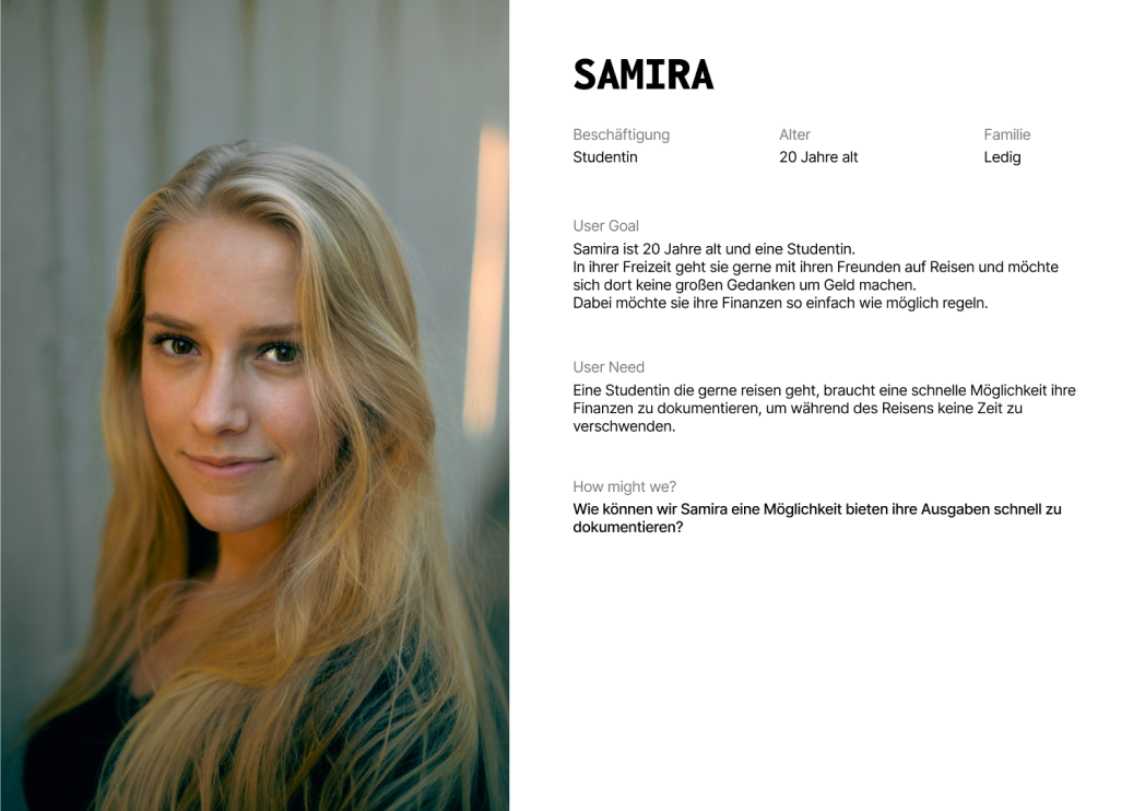
In order to learn more about what the users need, we conducted interviews with various Splitwise users.
This resulted in personas that either already actively use Splitwise to manage their shared finances, for example in shared flats, or new users who have joined via their friends for holiday groups.
Most of them found the app to be rather demanding and not very enjoyable.

Information Architecture
Low-Fidality-Wireframes
Design Brand Filters
Storyboards
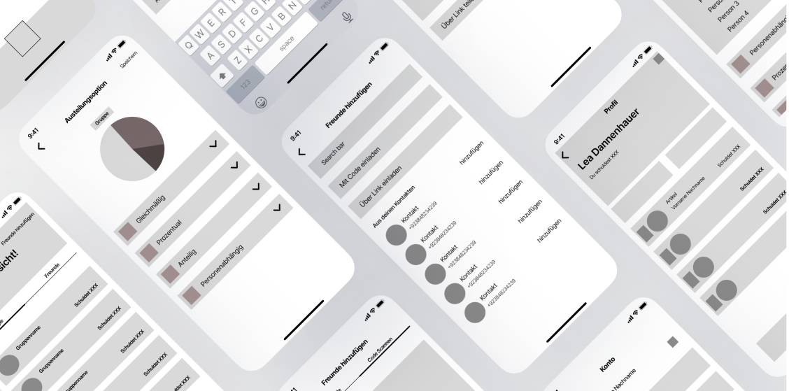
Based on the findings from the previous results, we developed a new concept for the app. We paid particular attention to clear information architecture and easy navigation. Initial low-fidelity wireframes helped us to test different layout variants before entering the design phase.
To ensure a consistent visual style, we created design brand filters:
Keyframes
Wireframes
Colour scheme
Icons
Typography
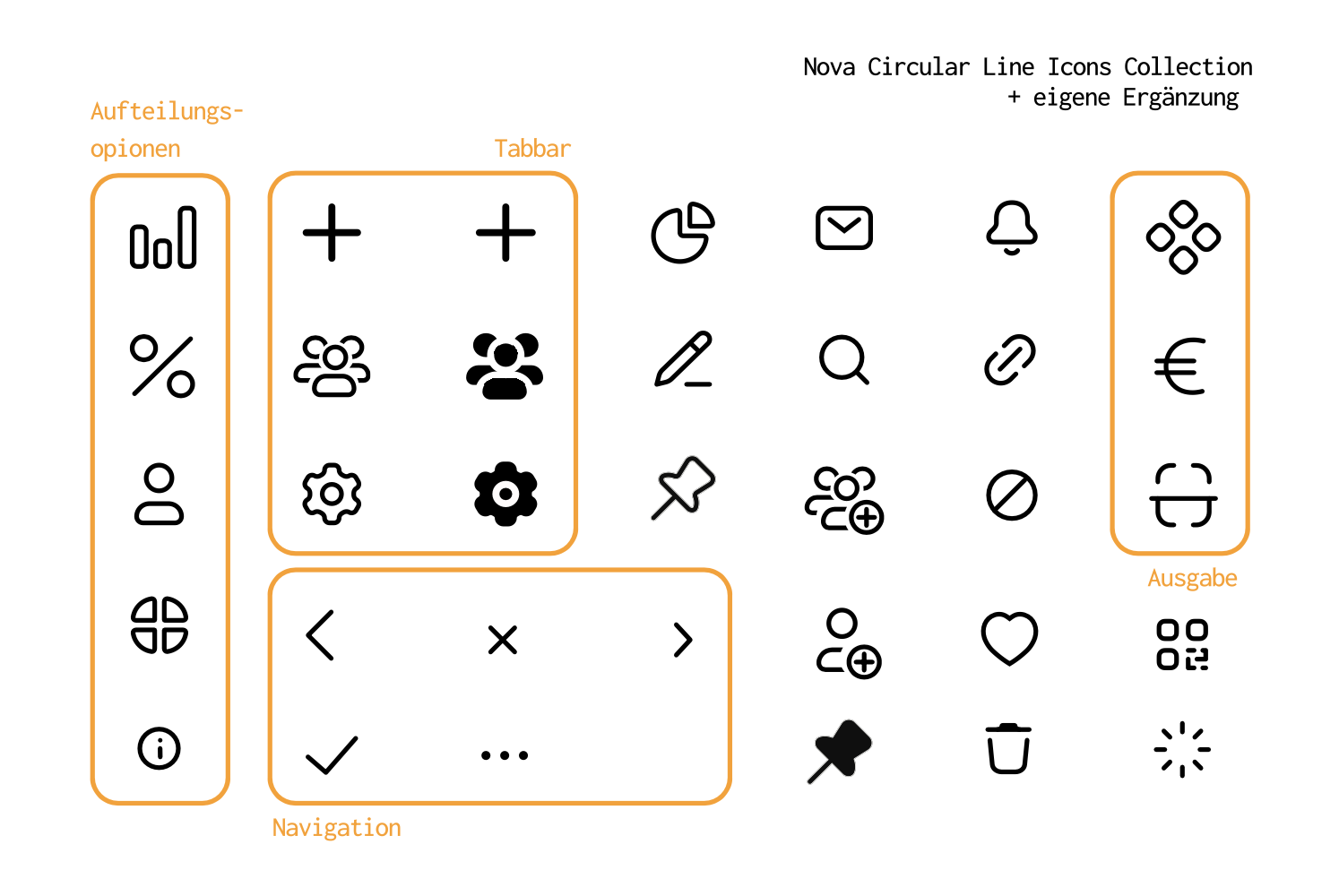
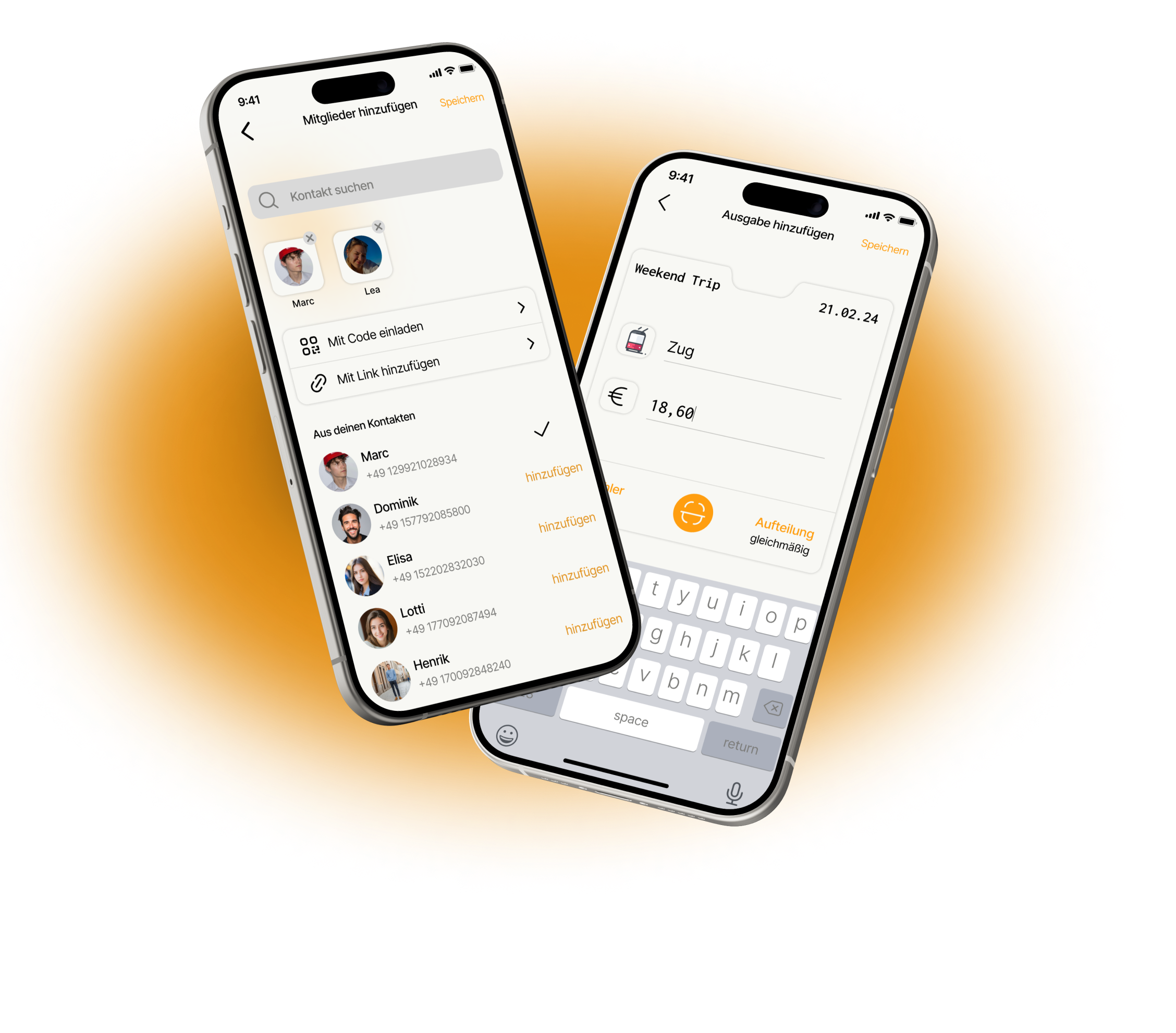
Our initial paper sketches were translated into detailed Figma wireframes. Each team member contributed by creating keyframes to develop different design ideas before we settled on a final direction.Playful Icons were a central part in making the app friendly yet clear.
We used vibrant colours to lighten up the financial theme while maintaining a clear structure. The user experience was also emphasised by playful micro-interactions.
Develop Design Craft
Redesigning Splitwise gave me the chance to hone my critical thinking, time management, and attention to detail. Balancing the needs of the user with technical constraints required careful compromises, and I learned how to stay focused without getting lost in the details. Working extensively with Figma opened my eyes to the platform's full potential, allowing me to experiment with interactions, create intuitive wireframes, and push my design abilities further than before.
Growing Through Challenges
Throughout this project, I realized that design isn't just about visuals—it's about solving real problems for real people. Managing the project from concept to execution taught me valuable lessons in organization and maintaining flexibility in the design process. I had fun exploring Splitwise’s potential and truly embraced every challenge along the way.